Disciplines
- Brand Identity
- Environment
- Merch
- Packaging
Creative Director
Alex Ostroff
Art Director
Karen Schipper
Designer
Cecile Godin
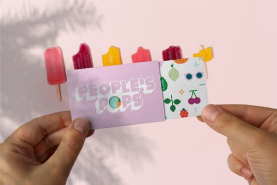
When People’s Pops was looking into taking strides into the CPG packaging industry, they sought us out to help define their identity. They wanted to fully become all that they could be without alienating certain customers and clients while keeping to their core of summer-loving, vibrant spirit.
Our goal was to build a visual and verbal identity that not only matched their current business but also amplified their spirit as they grew into new target segments.
Taking a closer look at who they are, People’s Pops was not just another popsicle brand behind a freezer. Rather, People’s Pops is a healthy fruit-centric dessert is made by a company of happy people radiating summer fun.
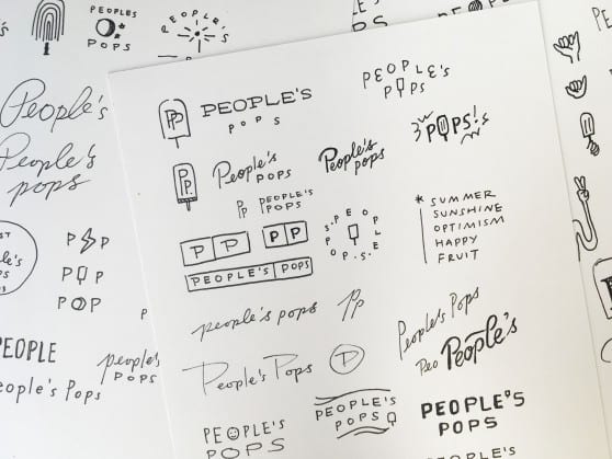
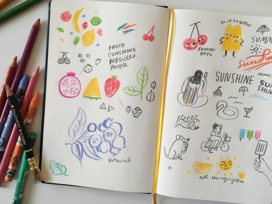
In our search for the right vehicle for telling the story, we explored over five different brand directions, including ‘Eternal Summer’ and our tagline ‘Life’s Too Short To Skip The Pops’.
Alex Ostroff
Karen Schipper
Cecile Godin


We are partners in creating unique voices that tell amazing stories.